A crowded street, a railway station, a city that never existed. Early picture postcards could make all three look like somewhere you might visit. Their small size encouraged a clear view: a landmark you could recognize, a route your eye could follow, a place reduced to a few memorable features.
Looking at them now, the useful question is not only what a place looked like. It is what the picture wanted you to notice. The views gathered here come from different sources and printings, rather than a single artist’s collection.
The street as a whole picture
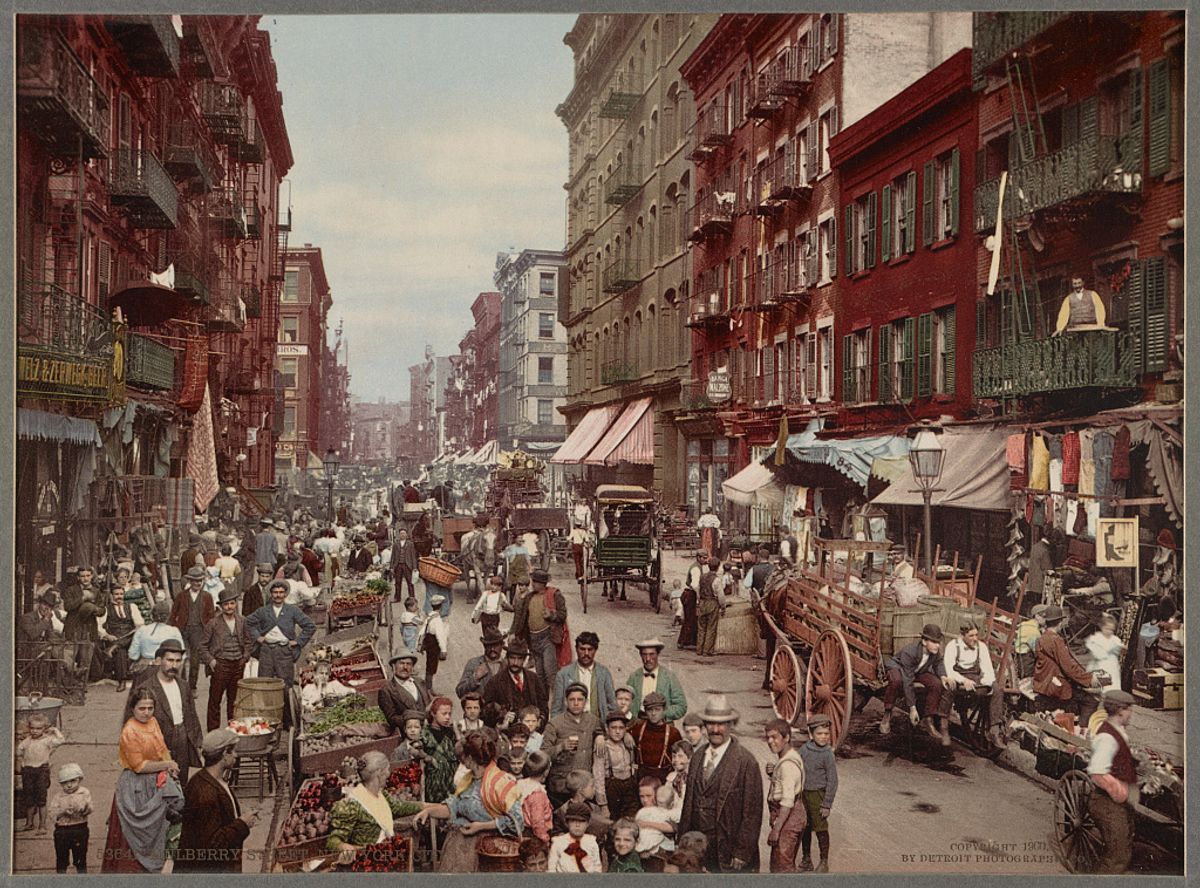
In the Mulberry Street print above, the awnings, carts, signs and people compete for space. The street runs back between the buildings, giving that crowded foreground a direction. There is plenty to inspect, but the view still reads as one place.
The cover is a Photochrom print published by the Detroit Publishing Company around 1900, not a postcard from a named collection. It belongs to the same commercial picture-making world. The company used a printing process to turn black-and-white photographic views into color images, so those colors should not be read as a color-film record of the street.
A station worth sending
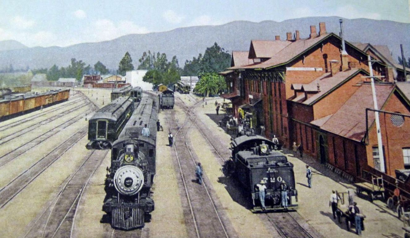
The San Bernardino card gives the railway a starring role. Two locomotives face the viewer, the tracks pull the eye into the distance, and the station fills the right side. The mountains are visible, but they sit behind the machinery and the building.
A traveler could send a picture of scenery. This view offers a different kind of attraction: the place where people and goods move. The small figures beside the engines also make their scale easier to read. Look at the composition before treating the card as a simple record of the station.
A city that had not happened
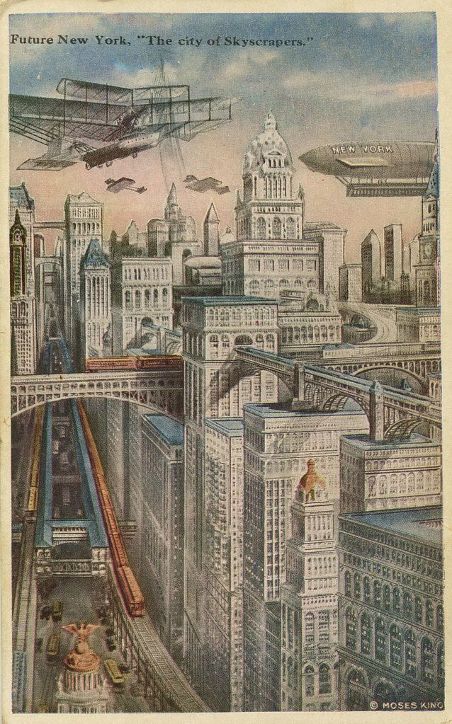
Future New York makes the promise explicit. Flying machines cross the sky above tightly packed towers, while railways run on several levels. The streets do not open into quiet space. They lead toward more buildings and more movement.
This circa-1925 printing imagines a future rather than documenting a view. Put it next to the station card and the difference is useful: one makes an existing transport hub look worth seeing; the other invents a city around the excitement of transport. A postcard could sell an idea as readily as a destination.
One picture, different objects
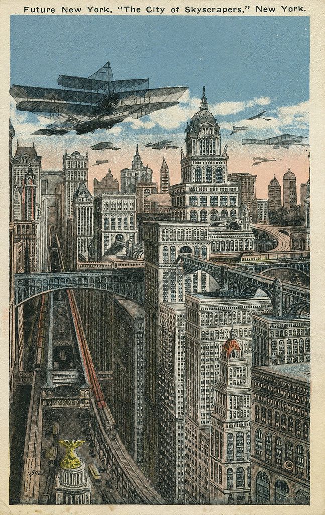
The second Future New York printing repeats the scene, but changes how it reaches you. Compare the wider border, the position of the title, the blue sky and the stronger outlines. The central tower and the large aircraft remain recognizable while the printed surface feels different.
That makes the publisher and the particular copy worth keeping track of. Two cards can share a composition without being identical objects. Differences in printing, condition and reproduction can also change what you notice, so a darker scan alone does not prove a deliberate artistic decision.
What a collection lets you notice
Walker Evans recognized the interest in these everyday pictures. The Metropolitan Museum of Art holds the thousands of postcards he collected and sorted by subject. Its online gallery for the 2009 exhibition shows examples from that archive. The cards illustrated in this article are independently sourced examples, not scans of his physical collection.
You can use the same approach with a handful of cards from different places. Put stations beside stations, then compare the viewpoints, the size of the people and the amount of sky. Or group pictures by what they promise: a busy town, an impressive building, a future full of machines.
The pictures become more revealing when you stop treating them as interchangeable souvenirs. Each has made a choice about what a place should look like to someone elsewhere.