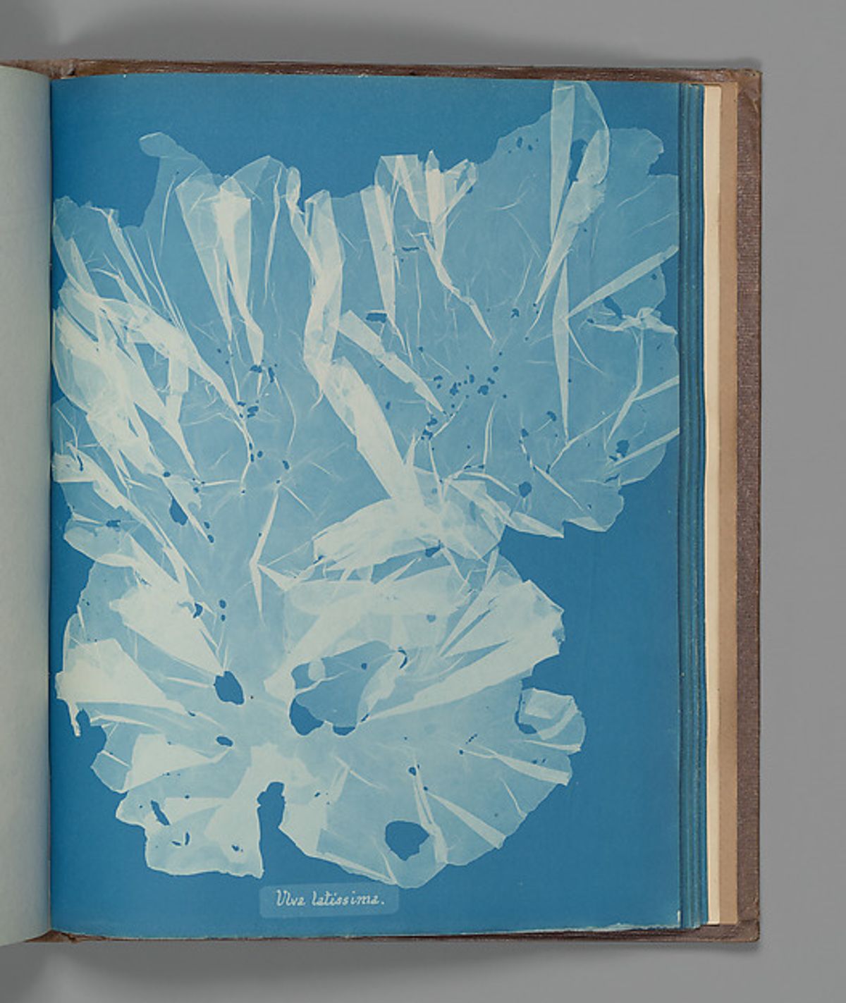
The algae in Anna Atkins’s Ulva latissima look almost weightless. Pale sheets overlap against blue paper, with enough space around them to make each fold visible. A small handwritten name sits below. The page is a scientific record, but it also asks for the kind of attention we give a carefully arranged still life.
A photograph without a camera
Atkins made these images by placing specimens on chemically sensitized paper and exposing them to sunlight. The objects blocked light to leave pale impressions against a blue ground. The Met describes her British Algae project, begun in 1843, as the first book illustrated with photographs. Its pages were issued in installments rather than appearing all at once.
That direct contact matters when you look at the pictures. There is no distant viewpoint and no horizon. The sheet becomes the entire setting. A specimen can spread across it or gather into a dense knot, and its edges become the boundaries of the picture’s activity.
Look at what the blue leaves open
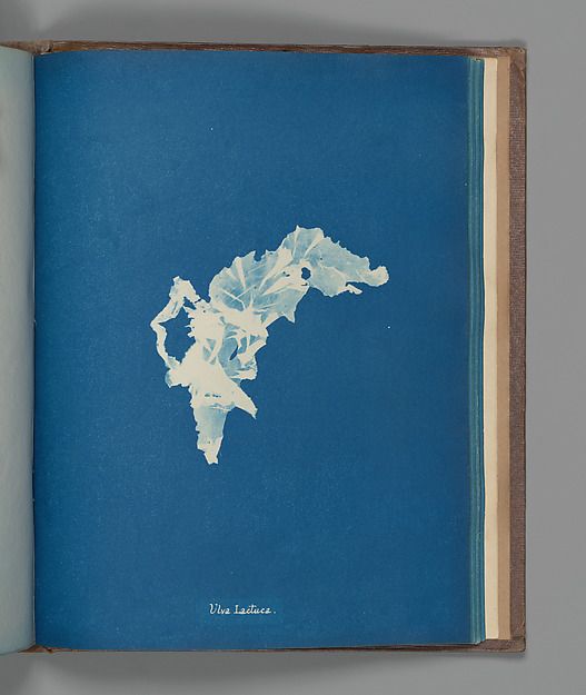
Compare the Met’s Ulva lactuca with the broader forms in Ulva latissima.
In Ulva lactuca, the specimen gathers into a small, irregular shape. Much of the page is simply blue. That open area makes the ragged edges easier to follow. The tiny lettering has room to be read separately, rather than becoming another texture in the plant.
The two pages show why a consistent process does not produce interchangeable pictures. One composition expands; the other contracts. You can compare their shapes because the background and method hold steady. The book’s repeated blue becomes a framework for noticing differences.
The name belongs to the picture
It is tempting to reproduce these pages as anonymous blue abstractions. The handwritten labels resist that treatment. They tell us that a particular specimen was being identified and placed in relation to others. Remove the name and the picture becomes easier to use as decoration, but part of its purpose disappears.
For someone making a photographic project today, there is a useful question here: what information should travel with the image? A date, a place or a species name may be central to the work rather than an administrative detail added afterward. Atkins’s pages let text and image occupy the same thought without competing for attention.
Read the album as an album
A single cyanotype can be striking. A sequence asks you to slow down and compare. Spend a moment with the edges, then the spacing, then the written name. Return to the other page and see what has changed. The interest is in those small decisions as much as in the recognizable blue.
These are historical collection images, not views of a current exhibition. Both individual works are dated about 1853 in the Met’s records. This spotlight is based on the museum’s digitized works and collection documentation.