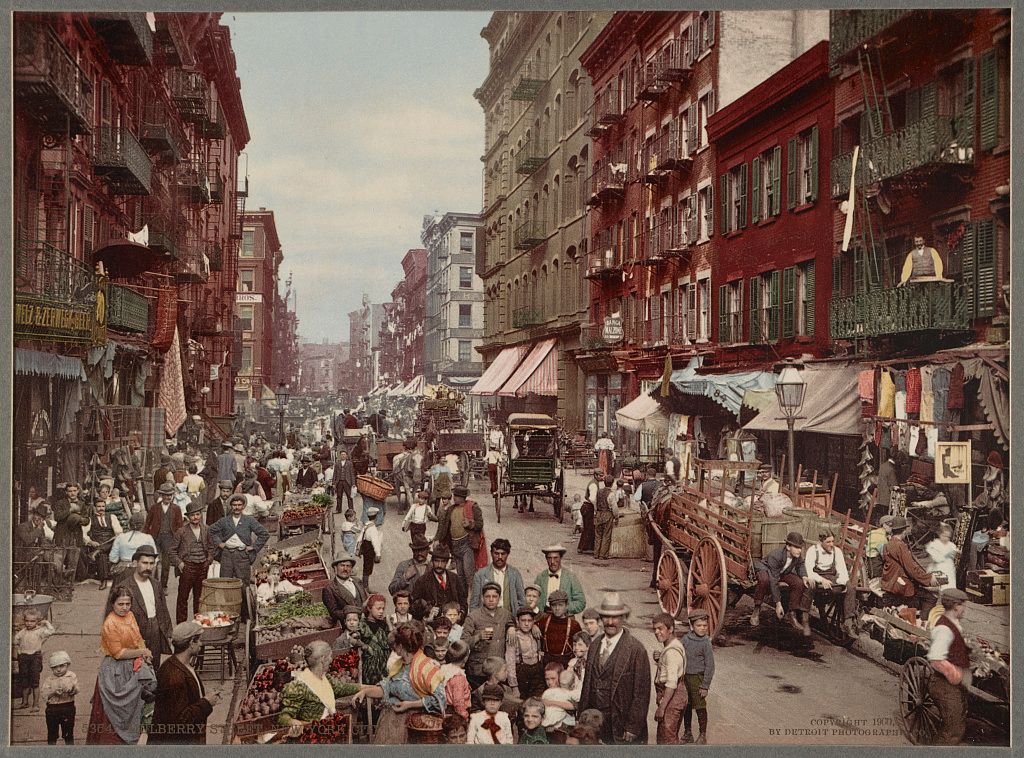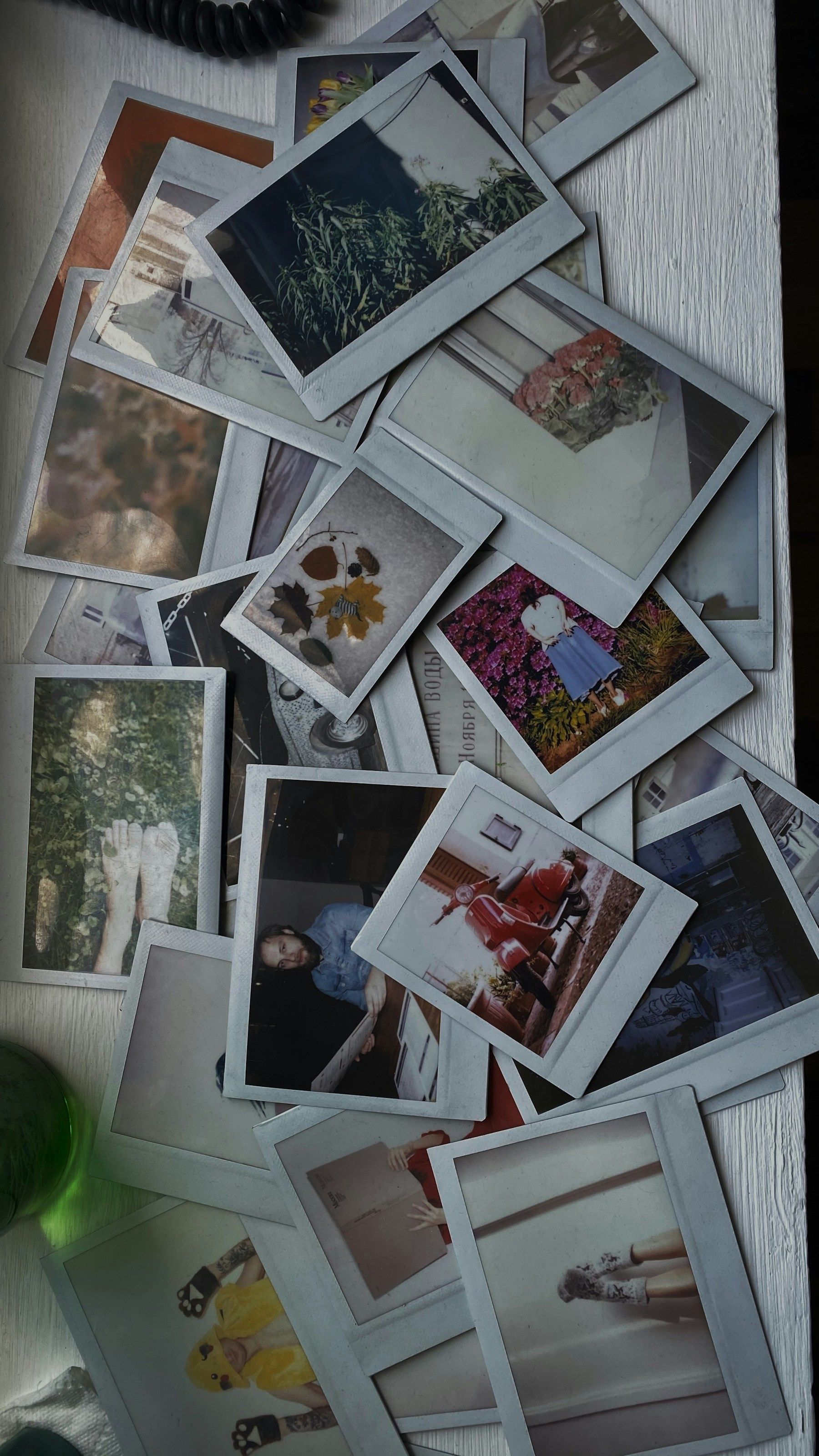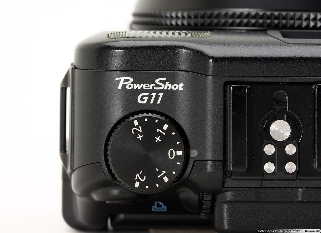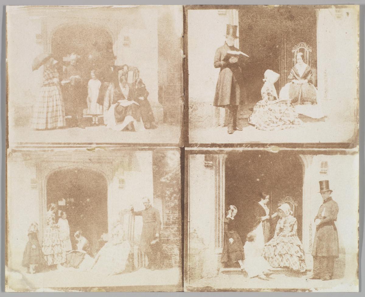
A contact sheet brings a group of photographs onto one surface so they can be compared. In film photography, it can be made by placing negatives against photographic paper and exposing them to light. Digital versions arrange thumbnails on a page. Both let you see relationships that disappear when each picture fills the screen.
A working surface
ILFORD describes contact sheets as a way to review the negatives on a roll, choose what to print and keep a record. The sheet is a step in the making of a photograph’s public life. It can show hesitation, repetition and several attempts at the same scene.
A traditional contact print reproduces negatives at their physical size. A digital grid can enlarge, rearrange or omit files. The label alone does not tell you which kind you are looking at. Check the caption, date, process and any explanation supplied by the photographer or archive.
Read the sequence before the red circle
Start with the sheet’s ordering. Frame numbers can help establish a sequence, but strips may have been rearranged, cut or shown selectively. Do not assume a neat left-to-right progression unless the object supports it.
Look for what changes across adjacent frames: a person turns, a hand clears a face, the photographer moves closer or a bright object enters an edge. Then look for what stays. Repetition may reveal the relationship the photographer was trying to resolve.
Compare two plausible choices
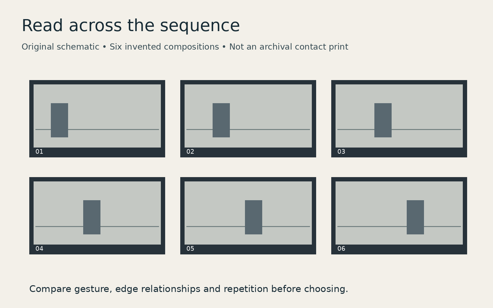
Choose a pair rather than immediately hunting for the famous final frame. In our invented six-frame diagram, the vertical shape moves across a stable horizontal line. An earlier frame might leave more room in front of the shape; a later one might create a tighter relationship with the edge. Neither is automatically correct.
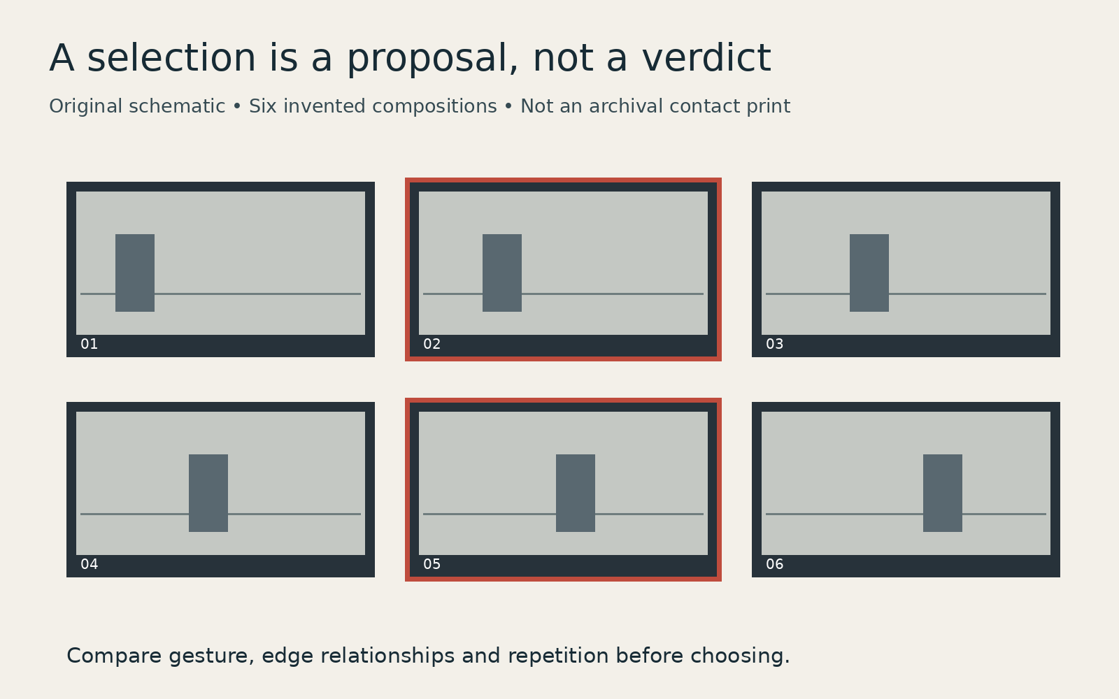
Ask what the picture needs to do. An opening image for a sequence may need context. A single portrait may depend on one gesture. The sharpest frame is not necessarily the most expressive, and a striking thumbnail can fail when enlarged.
Treat marks as evidence with limits
Circles, crosses and grease-pencil notes can record an edit. They do not, by themselves, identify who made the marks or when. A photographer, editor, printer or later researcher might have handled the sheet. Look for an archive’s account before assigning a decision to someone.
Nor is an unmarked frame proof that the photographer rejected it. A sheet may have been a reference copy rather than the copy used for selection.
Make a comparison sheet of your own
Export a small, clearly numbered grid from one shoot, keeping the original order for the first pass. Pick two or three candidates and write one concrete reason for each: a cleaner edge, a more revealing gesture or better context. Open those files at a useful size to check focus and detail.
A contact sheet is valuable because it keeps alternatives visible. Read it as a record of possibilities, with its own omissions and handling history, rather than a transparent account of someone’s thoughts.