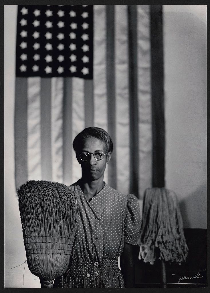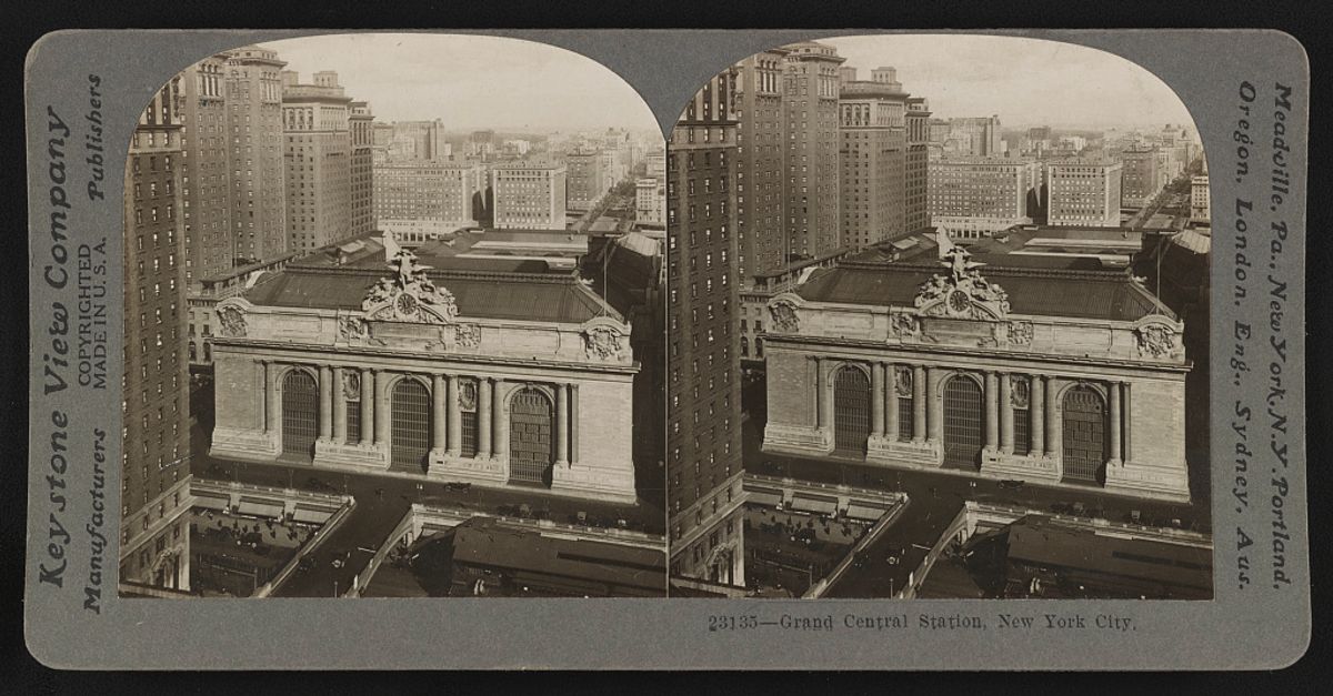
At first, a stereograph can look wasteful: two photographs of almost the same thing, printed beside each other on a card. The repetition is the mechanism. Seen through a stereoscope, the paired viewpoints can produce the impression of a single scene with depth.
The format found a large audience in the late nineteenth and early twentieth centuries. Cards were sold separately and in boxed sets, through shops, mail order and traveling salespeople. A collection could bring distant cities, industrial sites and natural landmarks into the same room.
A city, twice
The Keystone View Company card of Grand Central Station, copyrighted in 1920, shows the building from above. The station’s facade occupies the near part of each picture, while taller buildings lead the eye toward the distance. The two views are close enough to seem identical at a glance.
Move your attention between the station roof, the near building at the left and the skyline. The point is not to find a dramatic difference between the photographs. It is to notice that the scene has been recorded from neighboring viewpoints. The card was designed for a viewing device that would present the appropriate image to each eye.
A flat reproduction like the one here keeps both halves visible. It preserves the object’s layout, but it should not be mistaken for a demonstration that every reader will experience in three dimensions on a phone screen.
A waterfall arrives in the same format
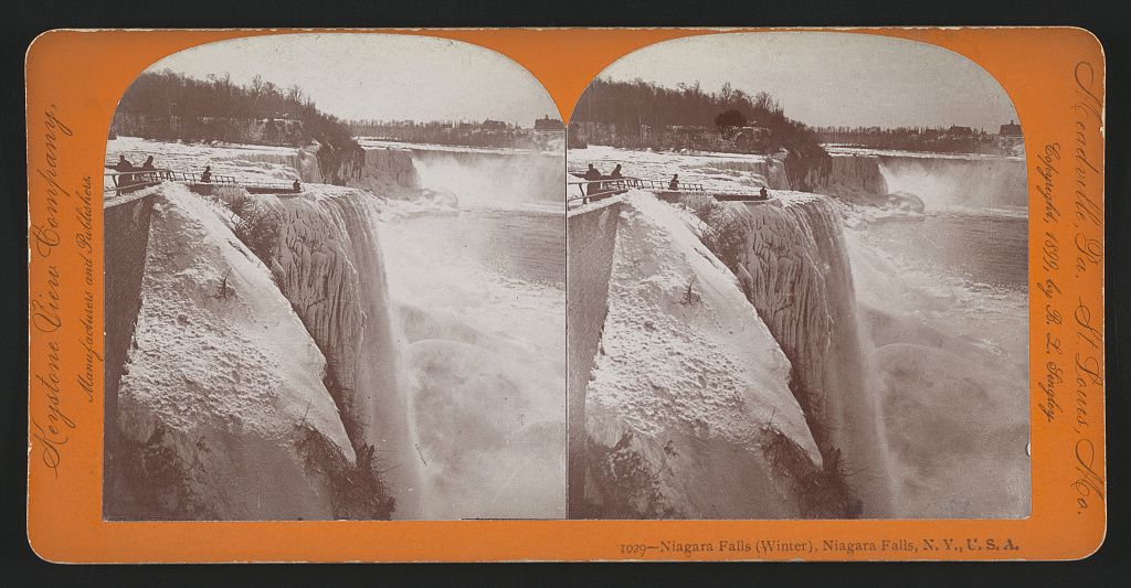
Keystone’s 1899 winter view of Niagara Falls exchanges the city’s hard edges for ice, water and mist. A railing runs along the near side, with people small against the scene. The edge of the falls creates a strong divide between the solid foreground and the space beyond.
The card gives the viewer something near to look past. That relationship matters more than simply filling the image with a famous destination. The foreground establishes a position from which the waterfall can seem to recede.
These photographs show historical conditions. They are not evidence of what a viewpoint, railing or access route looks like today. Their value here is in the way the scene was packaged for looking.
The border carries part of the story
Keep the mount in view. The company name, place label and number make the card more than a pair of photographs. They tell the owner what they are looking at and suggest that there are other views to collect. The format makes a city building and a waterfall belong to the same kind of object.
That consistency is part of the appeal. A reader could compare locations while handling cards of much the same size. The scene changed; the small ritual of placing a card in a viewer stayed familiar.
The photographs also depended on choices made before they reached that viewer: where to stand, which part of a place to show and what to call it. Depth could make a scene compelling without making those choices disappear. Looking at the whole card, rather than cropping away everything around the pictures, helps keep them visible.